NOVEL
creative
built for
impact

CAMILA
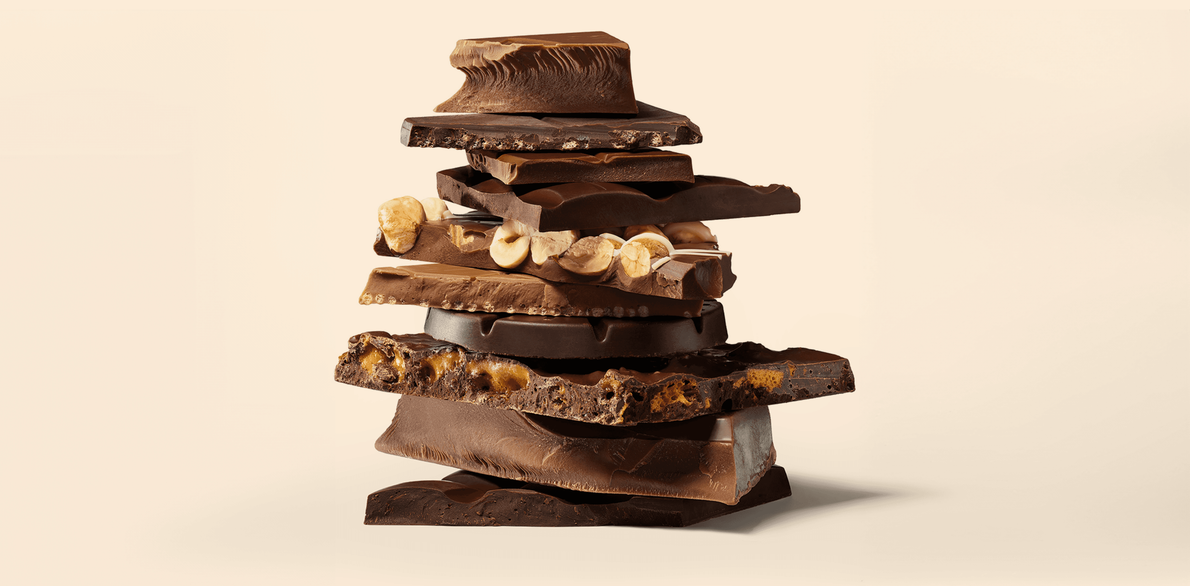
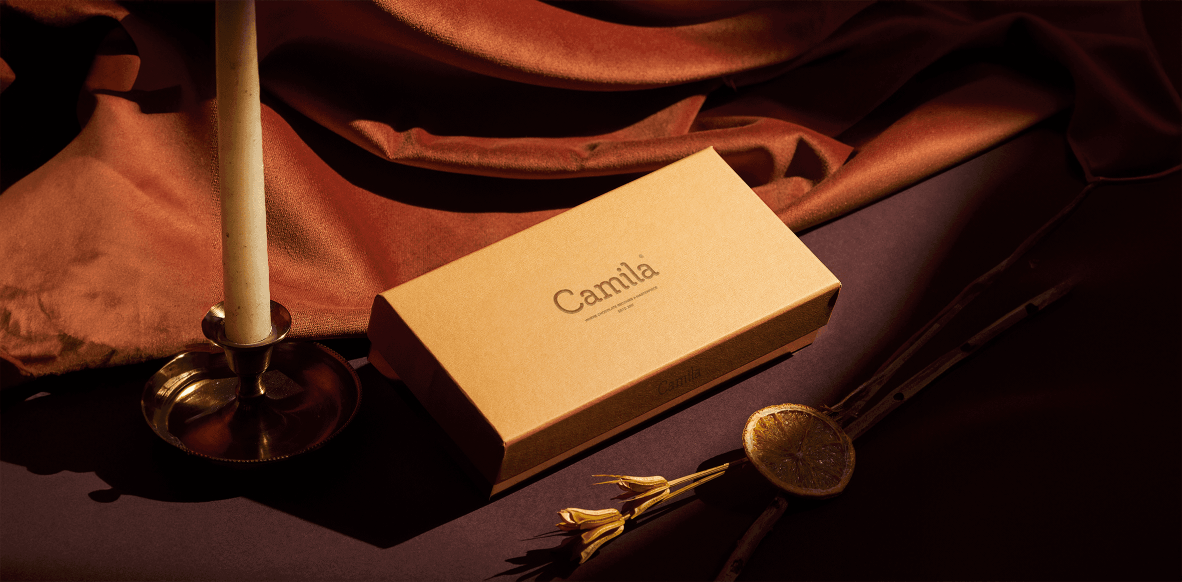
The visual identity of Camila embodies luxury and quality in a simple and elegant manner, employing simplified geometric shapes and luxurious color gradients such as gold, beige, and antique brown. The logo stands out with thin and elegant lines, accompanied by small symbols that represent Camila's unique identity. Balance and harmony are achieved in the design through the use of negative space and the cohesive arrangement of elements. The logo combines simplicity of forms and line elegance, with a focus on luxurious colors and distinctive symbols, to highlight Camila's exceptional visual identity.
The visual identity of Camila embodies luxury and quality in a simple and elegant manner, employing simplified geometric shapes and luxurious color gradients such as gold, beige, and antique brown. The logo stands out with thin and elegant lines, accompanied by small symbols that represent Camila's unique identity. Balance and harmony are achieved in the design through the use of negative space and the cohesive arrangement of elements. The logo combines simplicity of forms and line elegance, with a focus on luxurious colors and distinctive symbols, to highlight Camila's exceptional visual identity.
Year
Year
2017
2017
Industry
Industry
Food & Beverage
Food & Beverage
Type
Type
Branding
Branding